Lakefront Lifestyles
Lakefront Lifestyles Magazine was a monthly publication circulated to 41,400 readers in Oakland County, Michigan. Each issue featured stories about business, leisure, destinations, wealth, and lifestyle. Below, you’ll find highlight spreads from various issues. Sadly, as of 2024, the magazine has closed its doors, and its website is no longer active.

A few cover shots highlighting the magazine’s diverse Michigan-based content. I typically try to use a photo that can interact with the masthead, giving the cover a more dynamic look while integrating the type and image. A few article previews at the bottom let the cover subject take the lead while offering a look at other interesting features inside the issue.

Friendship Circle is an Oakland County-based nonprofit that “provides assistance and support to 3,000 individuals with special needs and their families by providing recreational, social, educational and vocational programming. In addition to helping those in need, the Friendship Circle enriches its vast network of volunteers by enabling them to reap the rewards of selfless giving” (via friendshipcircle.org). This spread highlights Soul Studio — a supported art program with an open studio space and gallery for adults with special needs. For this spread, I leaned into a fun, colorful direction that matched the spirit of the story. I layered the design elements to create a collage-like effect in the composition without drawing too much attention away from the photography. Cooper Black rounded out the design with a bold and friendly typeface. Pun… somewhat intended.

This incredible macro photo of a fly fishing lure made for a nice complement to the article title on this spread. Seeing the incredible detail larger than life feels as if it could only be crafted through magic. I like the simplicity of this layout, and how the design elements seem to just nestle together. The diagonal cut across the spread brings the reader’s eye from the title to the body copy and suits the shape of the fishing rod, which is actually a photograph I modified to look like a vintage illustration. The fish Ann Miller is holding is really eyeing up that fly — must be hungry for seconds.

This stunning photo capturing the St. Joseph North Pier Lighthouses at sunset was simply too beautiful not to showcase as a full spread lead-in. For the article title, I wanted to play on the “Michigan’s… secret” aspect by connecting the first and last word of the title, since they work together to describe the essence of the article in just a few words. Using inverse colors from the sunset for “Michigan’s… secret” and an italic for the other words in the article title created contrast and drew extra attention to their separation. I think the title still reads as a whole because of the stark design elements used in this spread. For good measure, I added a thin line to connect the two pieces of the title and further emphasize the play on the typography.

This piece on morel mushroom hunting had some great macro photography I wanted to feature. On the right-hand page, I pulled browns from the morels to create a gradient in the “Shhh,” playing on the nature of the onomatopoeia itself: fading out as one would when shushing. A round, chunky font accentuates the lighthearted and organic nature of the article — fun pairs well with these fungi. After settling on this font, I was happy to discover it had some nice arrow glyphs that looked quite like mushrooms themselves, so I used one as an illustration and directional cue for the column jump in the text. The descending text columns on the right-hand page create a wonderful diagonal with the two morels on the left-hand page, giving the whole spread a very pleasant left-to-right, top-to-bottom composition. Beauty in the details.

This striking shot of the Anna Scripps Whitcomb Conservatory would surprise many to learn they’re looking at a photo of Detroit. With an image this detailed, I didn’t want to compete for visual attention in the spread, so I opted for something simple. Although I used a relatively small point size for the article title, boxing the text and lead-in gives the reader an obvious starting point. I used subtle layering with the conservatory dome, body copy, and box stroke to add a bit of dimension and interact with the perspective of the photo. I also emphasized “Explore” and “Michigan” within the title to act as its own subtitle for the article and give the title some added hierarchy on the page.
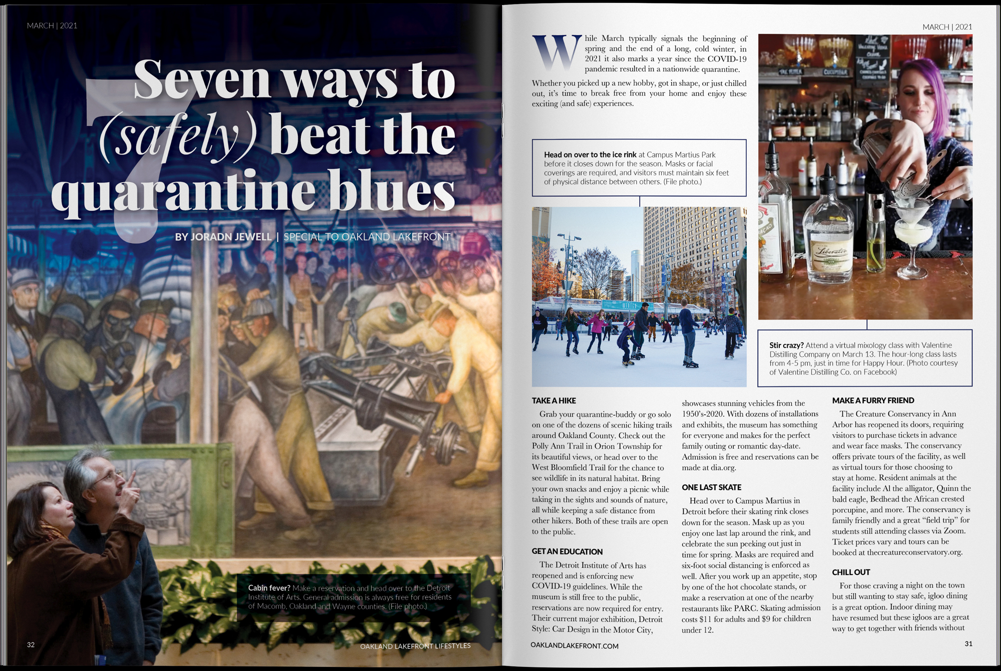
I like this spread for its simplicity. A little typographic flair, some good photography, and a clean grid come together nicely. Sometimes it doesn’t need to be too complicated. I really liked the way this photo of a couple admiring something at the Detroit Institute of Arts interacts with the article title. The headline is resting comfortably in a blue gradient I added to give the text some extra contrast on top of the photo and double down on the “quarantine blues.” For continuity, I pulled that gradient into the drop cap, which I think was also necessary to give the reader a starting point with the copy.
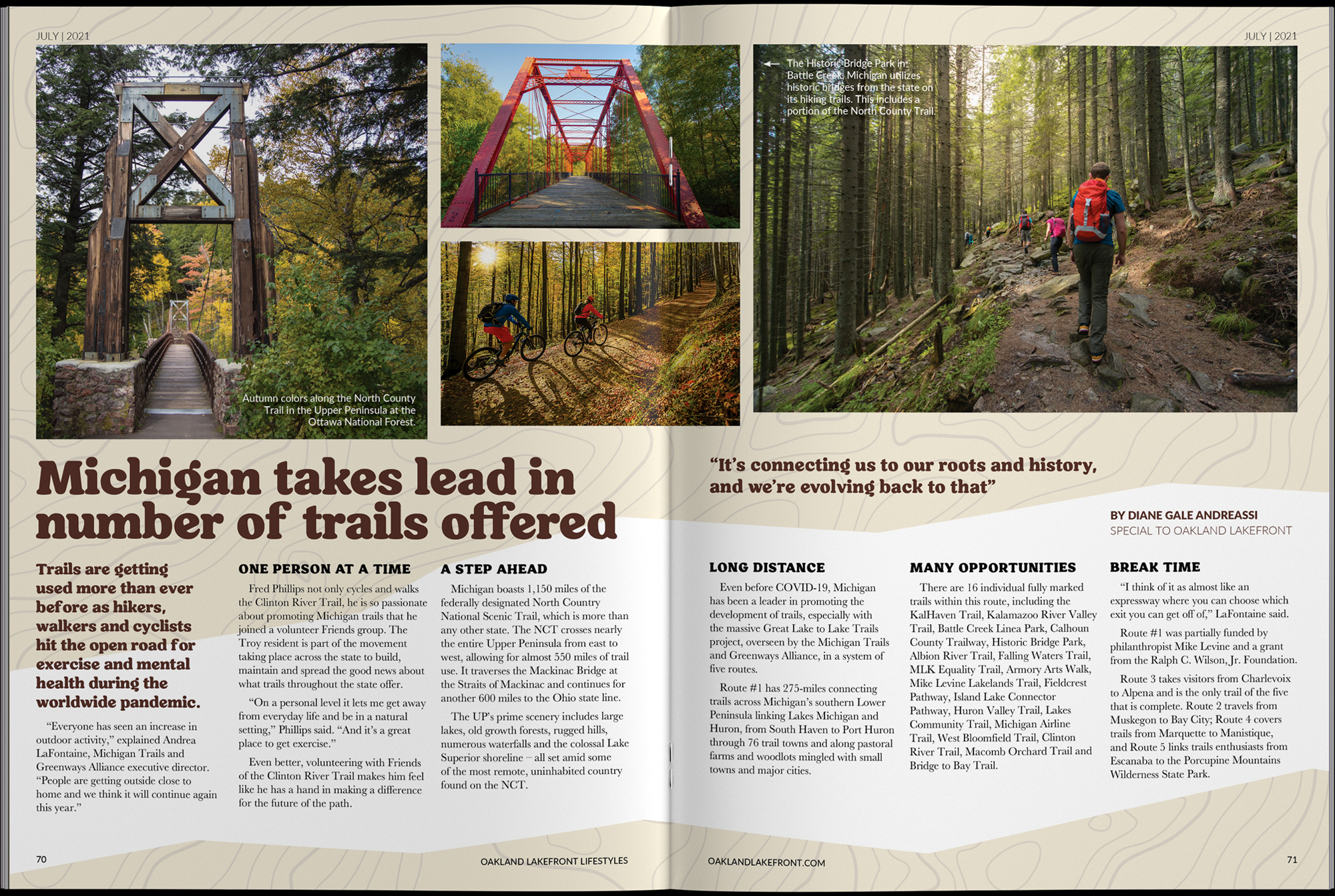
Another straightforward layout. I really like the way the design subtly moves up the spread across both pages, as if the reader is ascending a trail themselves. I used a light topography illustration to add some texture to the beige cutouts without overpowering any other part of the design.
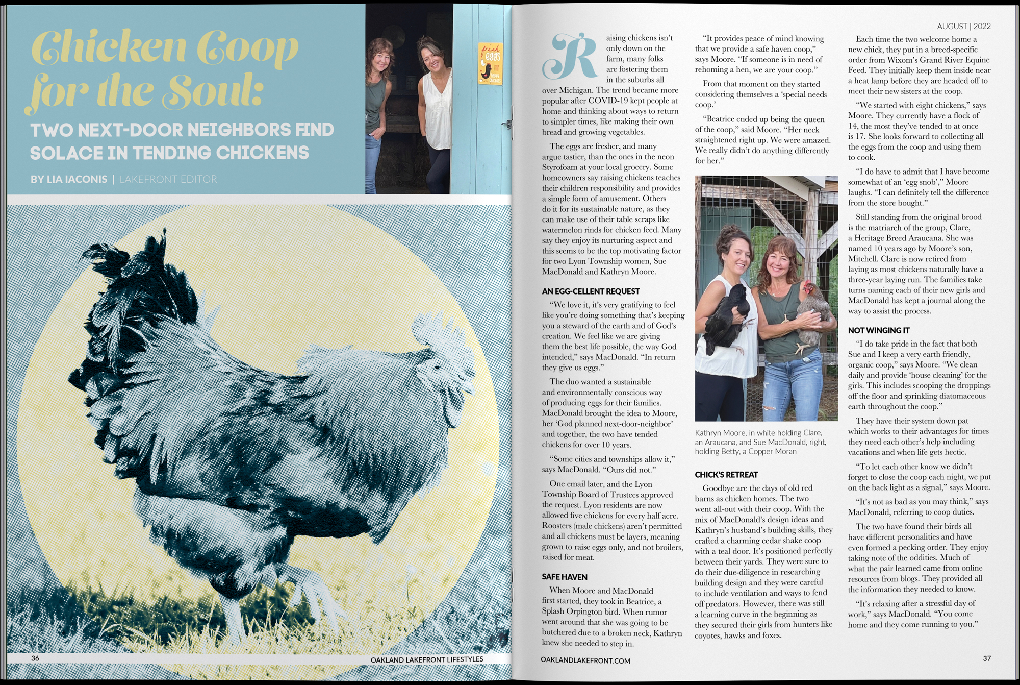
My jumping-off point with this spread was the photo of Kathryn Moore and Sue Macdonald standing in their sky blue doorway. It gave me a great color palette and lent itself to the compartmentalized title section. It is as if they are coming out of the layout to personally welcome you to their coop. I created this halftone chicken graphic with soul in mind by adorning him with a halo — which only seems right, as he is quite a handsome fellow. Egg-cellent, as the subhead suggests.

This article came to me with an extensive folder of photos, and I wasn’t complaining. A picture is worth a thousand words? Something like that. Using as much real estate as possible to showcase the jewelry and the hands-on processes these women were using was a priority. I used the negative space made by the hands in the hero image to nestle the title in. I think it adds context to whose hands these are, and what story they have to tell. To finish it off, I used the dotted line motif to sew the spread together — my own play on mending.