Event Marketing

Dark… Creepy… Crawly… Tsuruda. Typically I don’t wander off the beaten path for typography for these pieces. While there have been instances where they are used as print promotion, typically these are being seen through social media, most likely in the palm of peoples hands.

Keeping that in mind, I always try to feature the headliner's name large enough to catch the attention of people scrolling quickly. Knowing the video element was the main announcement, I knew there was room for a little more play in the static piece.
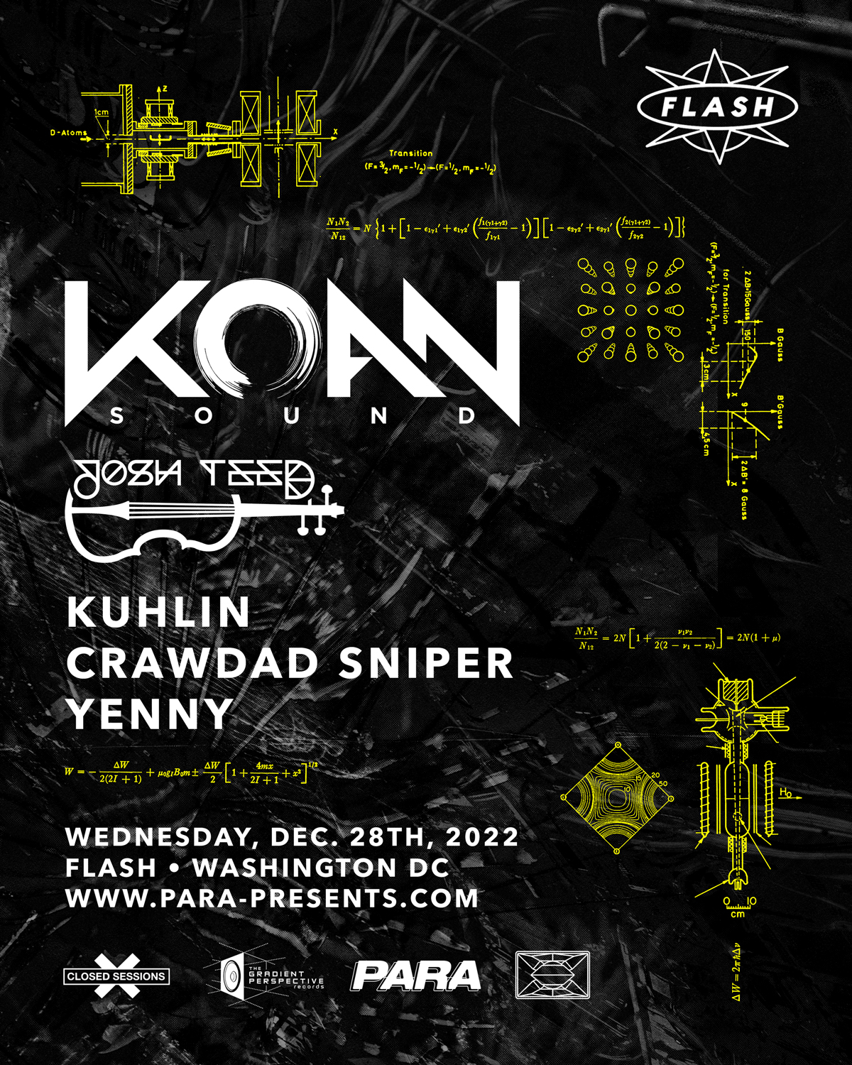
KOAN Sound produces highly complex and technical music. Spanning a wide gamut of genres, this producer duo can’t be easily categorized. Their sound is powerful, beautiful, electric, fast, slow, you name it — they got it.
Collaged image and video of the Large Hadron Collider, server racks, deep sea critters and modified equations of nuclear fission make the mix up for this one.
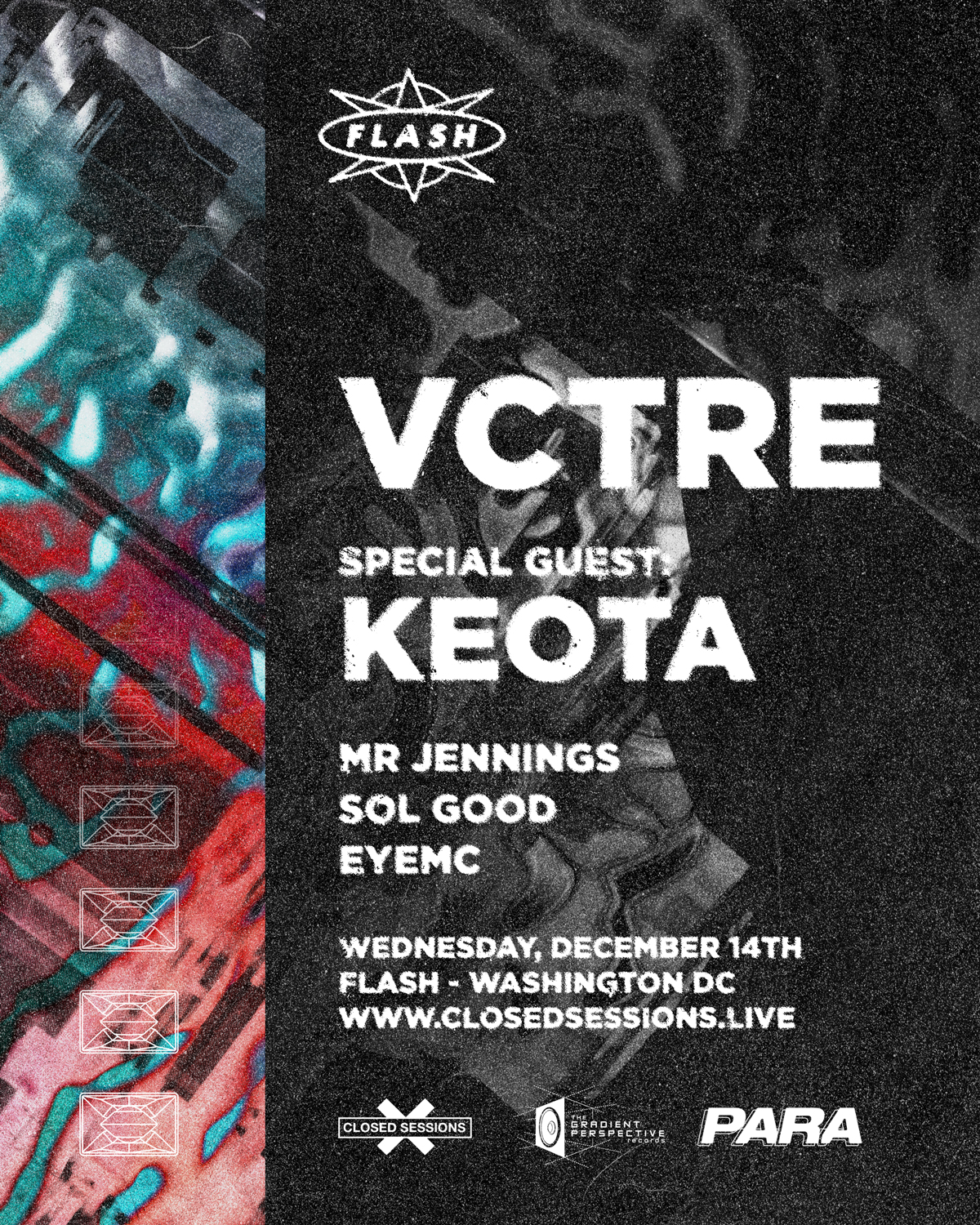
An up and coming artist, VCTRE takes a unique perspective on bass music. Guttural bass, twisted break beats, sultry house tunes — this kid can jam
For the visuals here we’re looking at the effect of sound on still liquid, rippling and jumping to the vibrations. A great match for the sound VCTRE is playing for the crowd.

The passing of rising producer Charles the First shook the EDM world. At only 25 years old, the musician still had so much to give to the world. This was a local talent showcase to benefit his family after his passing. Rest in peace CTF.

For this design I wanted something solemn and typographically tasteful while staying true to the darker musical aura these artists are centered in.

Traversing a musical spectrum, Diceman does it all. With a background in theater, every set is a roll of the dice giving a “unique, vibrant, emotive experience that keeps you dancing, thinking, and feeling some type of way” (via artist’s soundcloud). To complement this performative mystery I wanted to go with something dark and narrative. A larger than life hand (a modified photo of my hand) tells a gestural story casting a flickering pair of dice across the scene. The abstract background adds a dream-like backdrop up to the viewer's interpretation.

Hailing from Manchester, UK, Interplanetary Criminal stopped by DC on his debut US Tour. An up and coming artist in the garage scene, I wanted something dark and grungy with a pop of vibrancy, akin to the sound of the genre. A little nod to interstellar scenery and this one was good to go.

A don of the dubstep genre, Mala is a living legend in the space. I wanted to put the name up in lights for this one. A dark, grimey background blends with the sound, but does not distract from the sales point - Mala’s name in itself. Text and indicia details collected from day-to-day ephemera add to the graffiti-like nature of the design.

Omnom, described as a “delightfully unconventional brand of house,” … “a whirlpool of weird.” (via Resident Advisor) is a fun, vibrant soundscaper. This collaborative show between Para Presents and DMV Deep was billed as DC’s House Party. Modifying a photo of 1950s movie-goers alludes to the more interpersonal nature of the show. Music was not the only focus of the night, socialization was key.
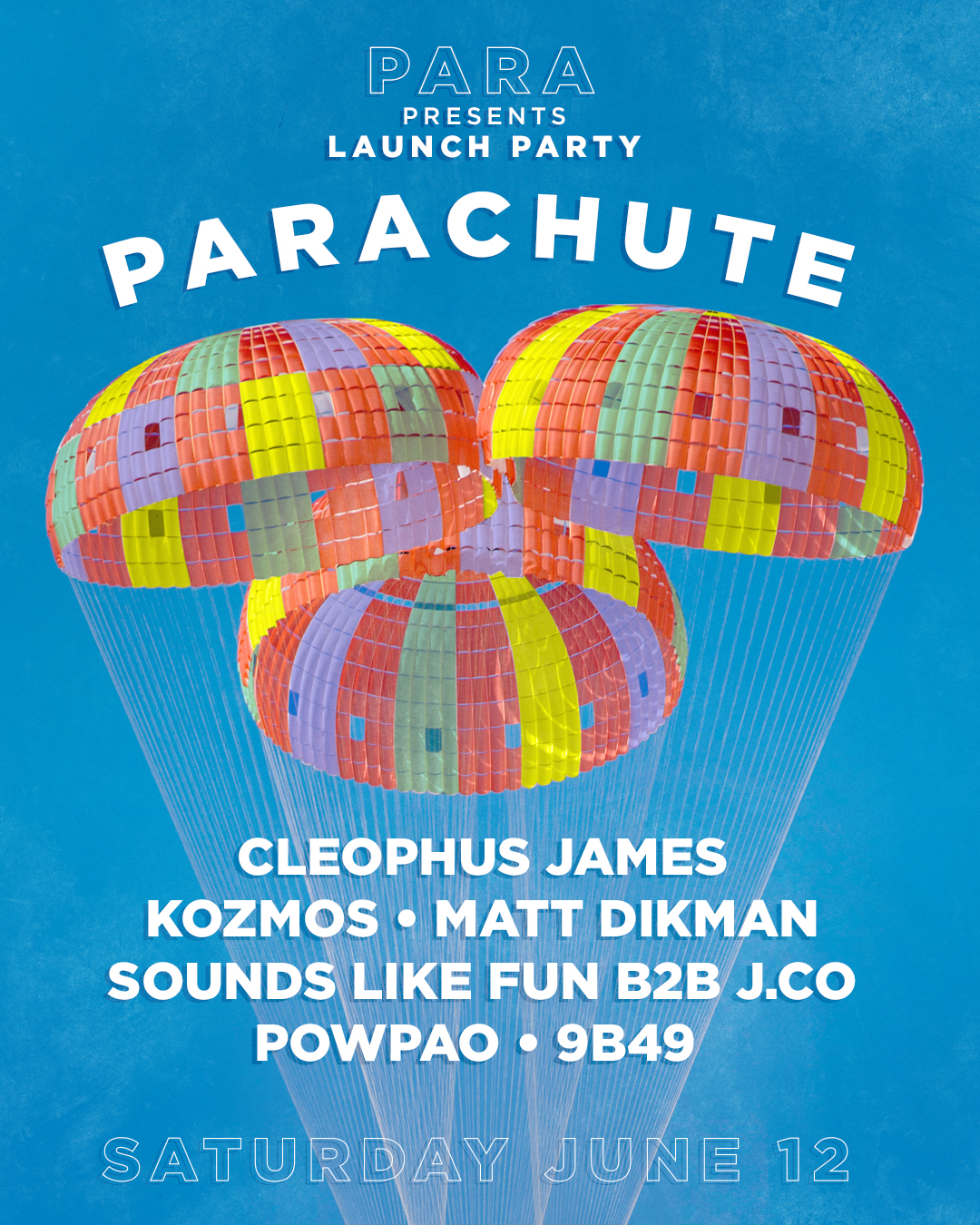
Para Presents: Parachute was aptly named as the launching point for the promotional company. Sourcing some terrific local talent from a variety of genres for a daytime, outdoor event couldn’t be anything but colorful and lighthearted. A modified public domain photo of NASA’s Orion Spacecraft parachutes test makes the perfect backdrop for this one. Primary colors popping against the blue sky transport you back to youth, galavanting under a colorful dome in gym class. For the curious, like the event, the Orion parachutes test was successful.
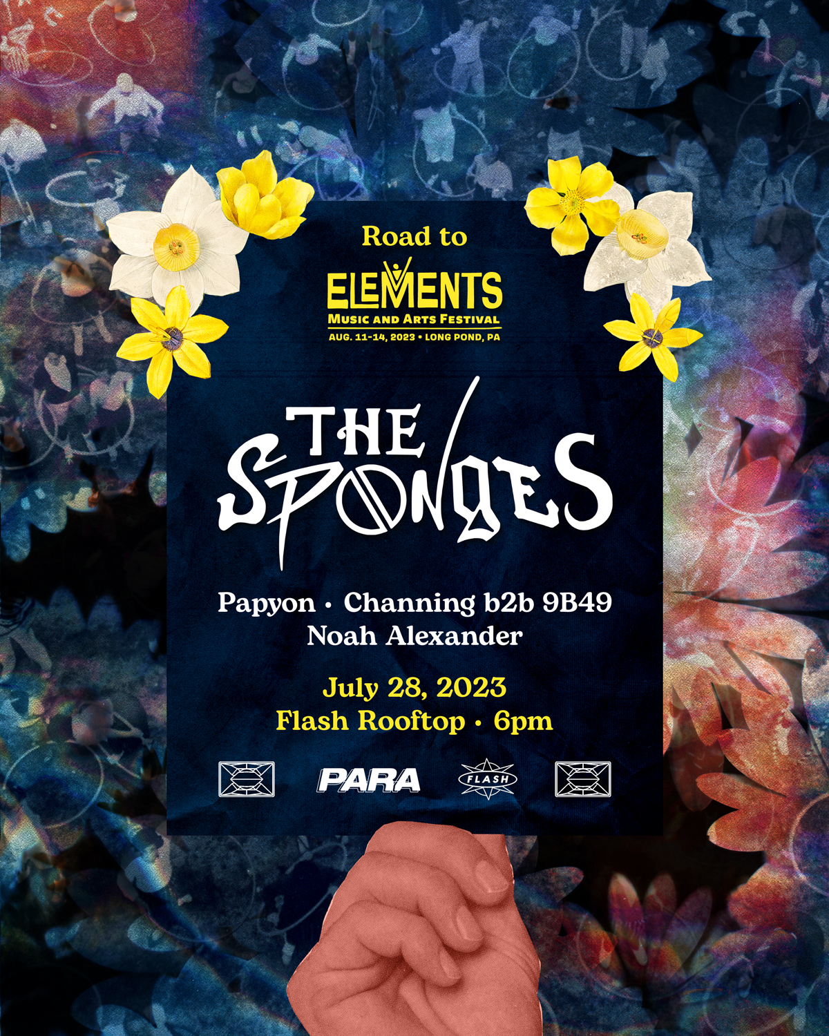
The Flash rooftop is the place to be on a summer evening in Washington DC. The sponges are a funky duo who rip bassy house cuts and fun grooveable tunes. Their shows are a hoot. Taking a nod from their own branding, I collaged vintage print media and added floral details to fit the lively atmosphere. A hazy image of young hula hoopers hangs in the background like a summer evening you might remember. A larger-than-life hand holds the show information up to you as if it’s a personal invitation to come dance.

The Convergence Project was a meeting of the minds for music, arts and culture. Warehouse style events with local vendors, live painters, art installations, 360° projection mapped visuals, and first class lineups. This was the first event of the series with a fan favorite lineup. For the design I played into the convergence of space, like the gravitational force of a black hole. Two faint grids converge to meet in the center of our interstellar composition. The Convergence Project logo was an original for this as well.

The second installment of The Convergence Project (see previous poster for details) featured Shades, a collaboration between Alix Perez and EPROM. Shades has a spooky, dark and mystical brand with tunes to back it up. Swirling mist and gothic architecture fit the bill nicely.
Process

(Ode to Scanner, Digital, 2023) Most of this work starts here with my Epson Perfection V600 Photo Scanner. I like to add a tactile element to my work to give it individuality and a personal touch. By taking a piece of ephemera from my own life I know the design will have elements that have never been used in design before. To me, this also gives value to otherwise instantly (easily) discarded things and further promotes its lifespan in a cycle of reduce, reuse, recycle.

Detail shot. I try to get as much detail as I can when scanning that can’t be replicated by a photograph. It’s what really sets the scanner apart in my mind. This particular scan is of the balled up paper that comes stuffed in a new shoe. The organic nature of these edges in such high detail is challenging to replicate digitally and is essential for my modus operandi. There is no questioning the authenticity of a physical object’s qualities.
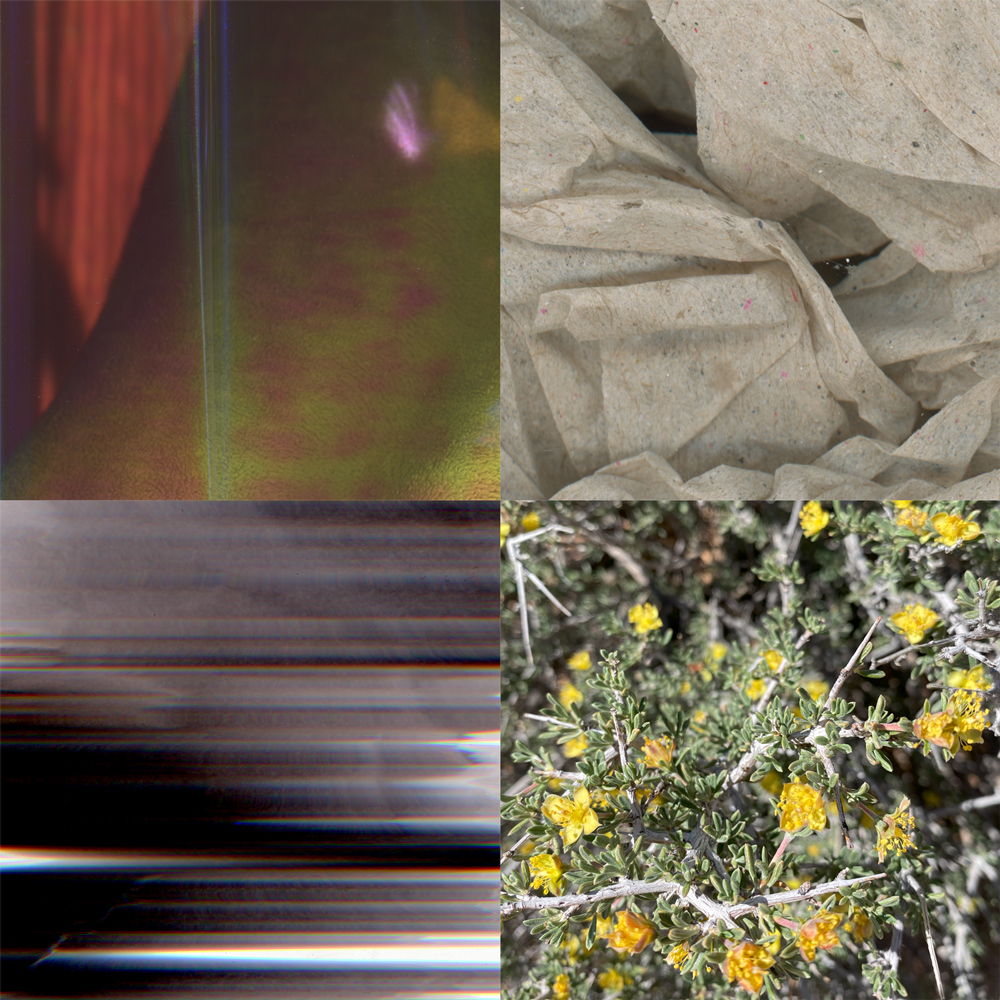
To illustrate my process I created an example design using four images I had on file. I picked these four in particular because they have virtually no relationship physically or visually. Three scans I made of various media, and one photo I took of Blackbrush (Coleogyne ramosissima) in Moab, Utah.
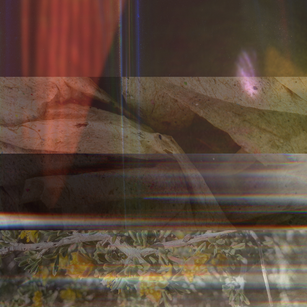
Here I’ve layered the four images in photoshop, reduced their opacity and cut the image into descending strips of overlap. The first strip being only one image, and the last strip being all four images overlayed. As you look down the image you can see the subtle changes each additional layer makes to the layers above.
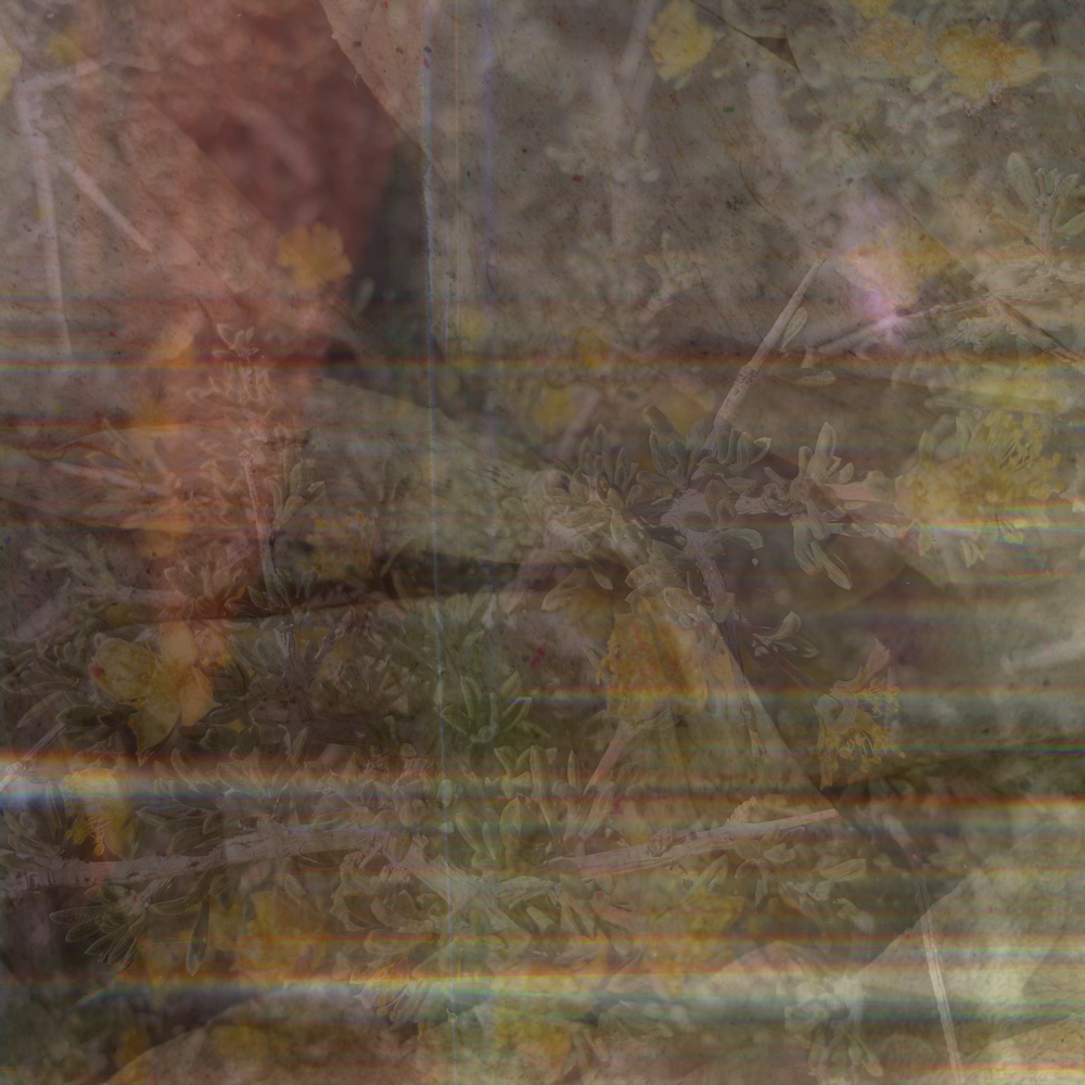
Now all four images in their entirety are stacked with reduced opacity. If you reference the above, you can easily pick out elements of each image and see how they subtly affect the composition related to their counterparts. Standalone however, this image does not boast obvious details from any one piece.
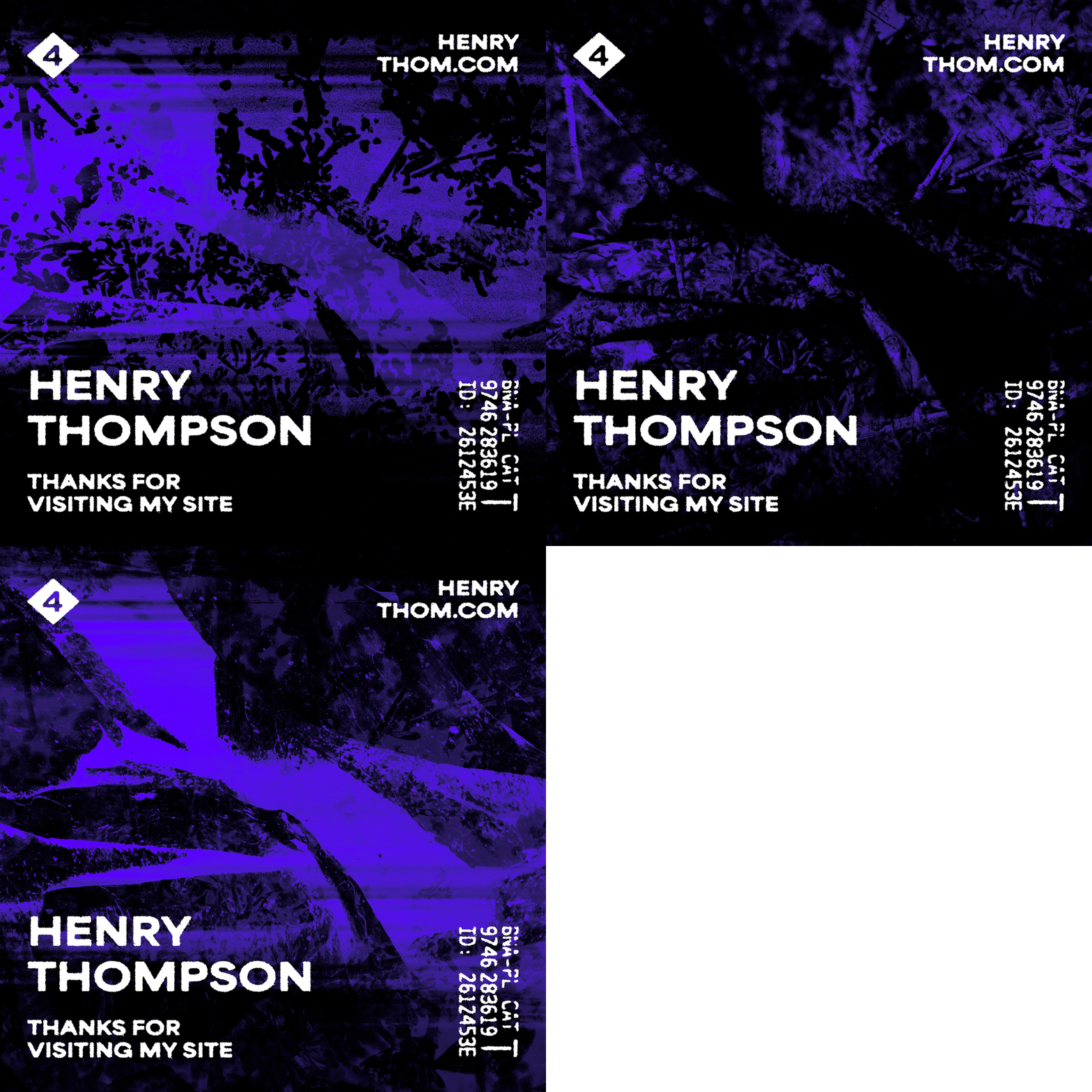
With some photoshop magic we have finished designs. I’ve used this GIF to show how much variety can be achieved with these four images in the same layer order and position. Three separate designs each emphasizing different compositional elements in a visually interesting way. I’ve added some text on top to mimic a flier on this page, including some design elements pulled from a receipt and shoe box.